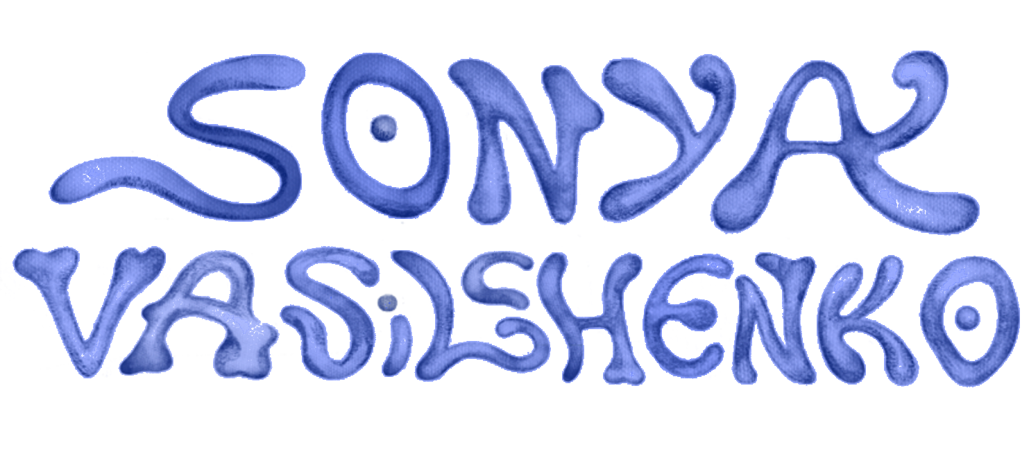
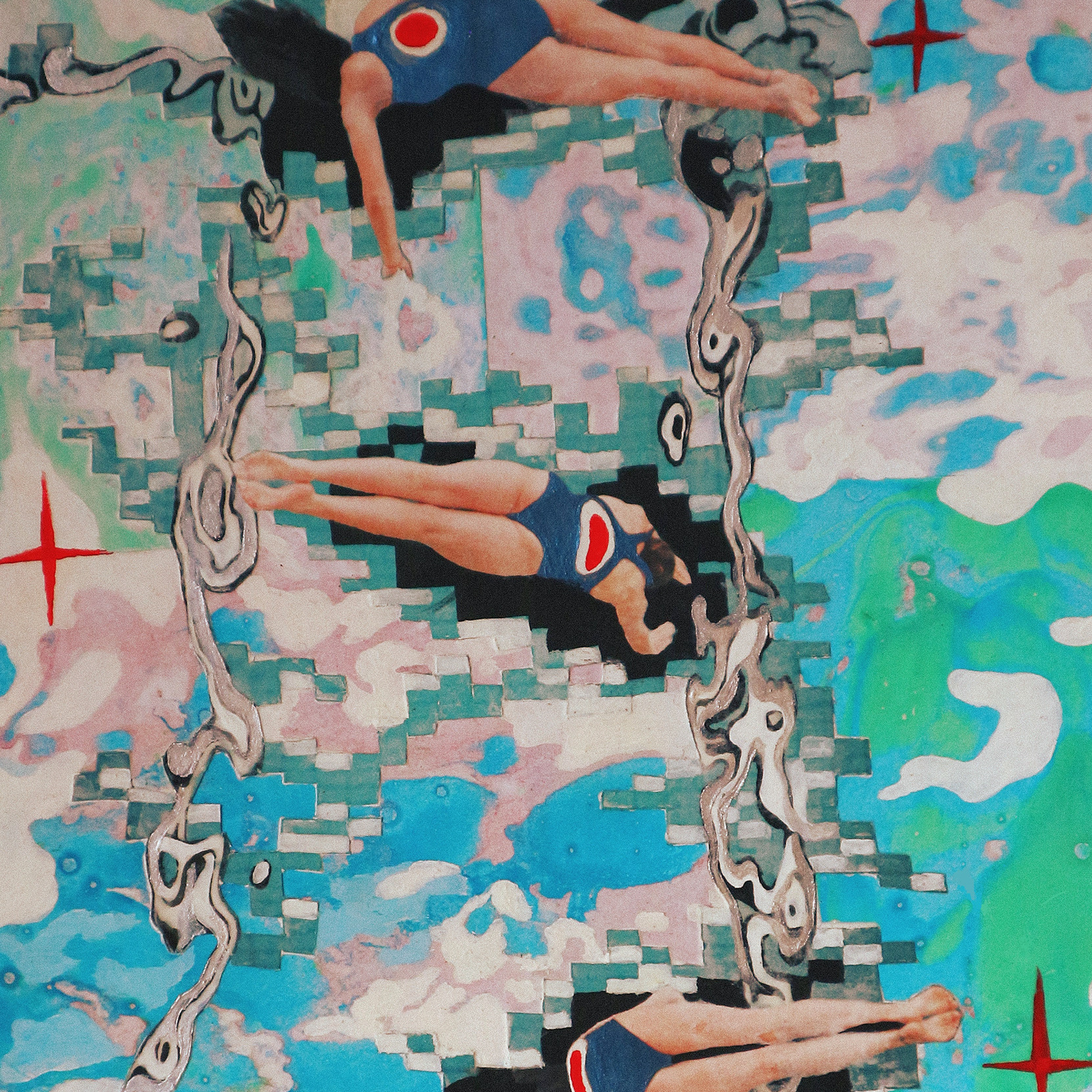
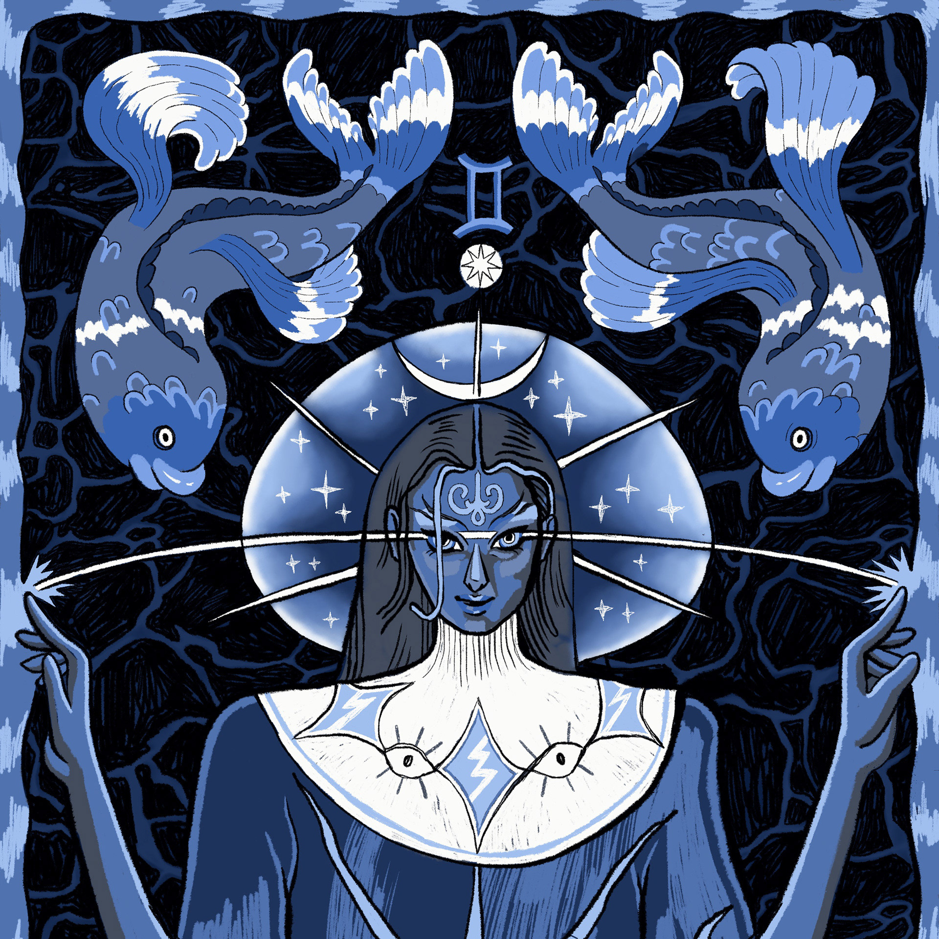
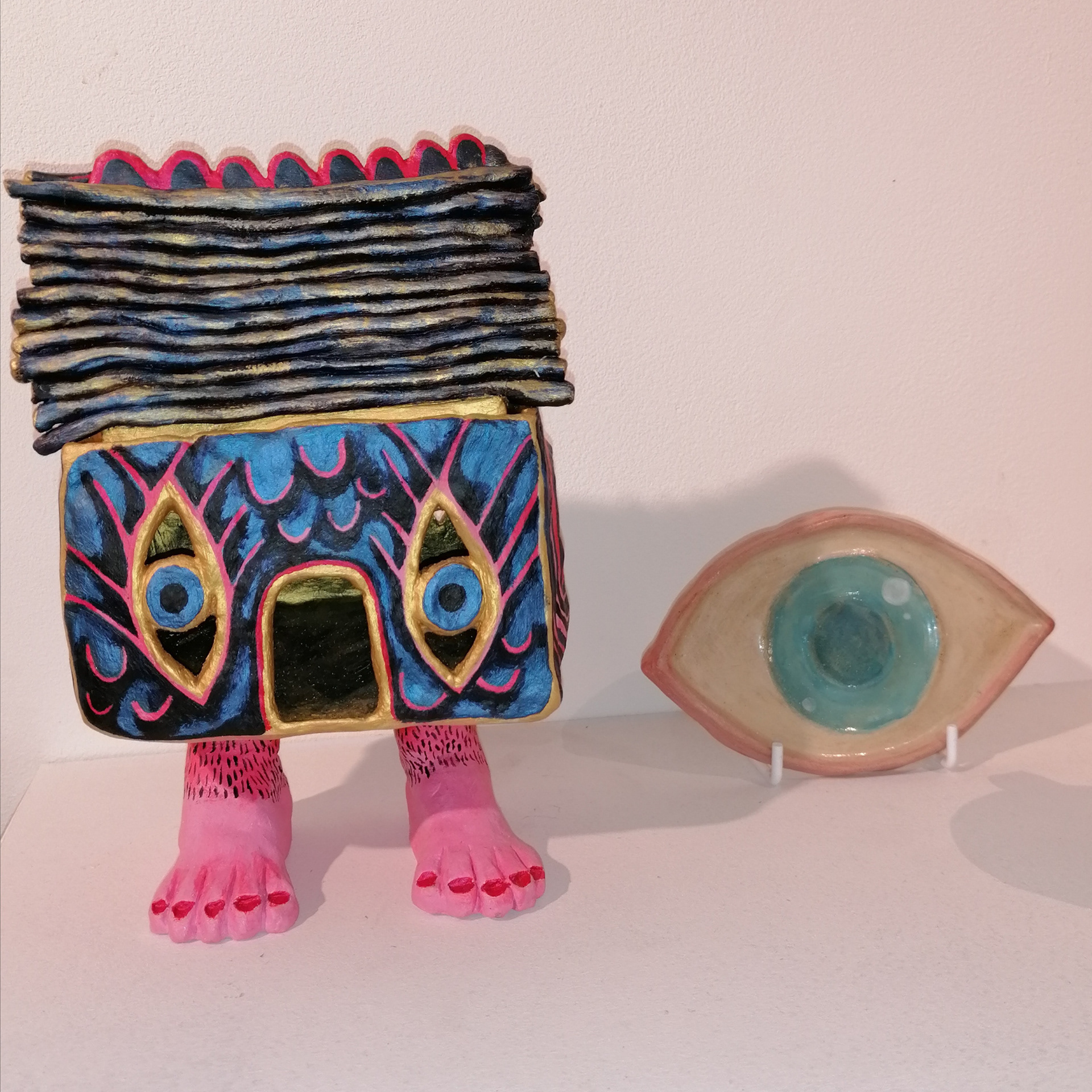
During my Graphic Design course we were set several type projects and were classically trained on Adobe Illustrator and Glyphs, with knowledge of kerning, leading, weight, serif/sans serif etc. With this foundational comprehension, I felt comfortable breaking the rules and experimenting with variable type.
Symbol typeface and stamp collection (2022)
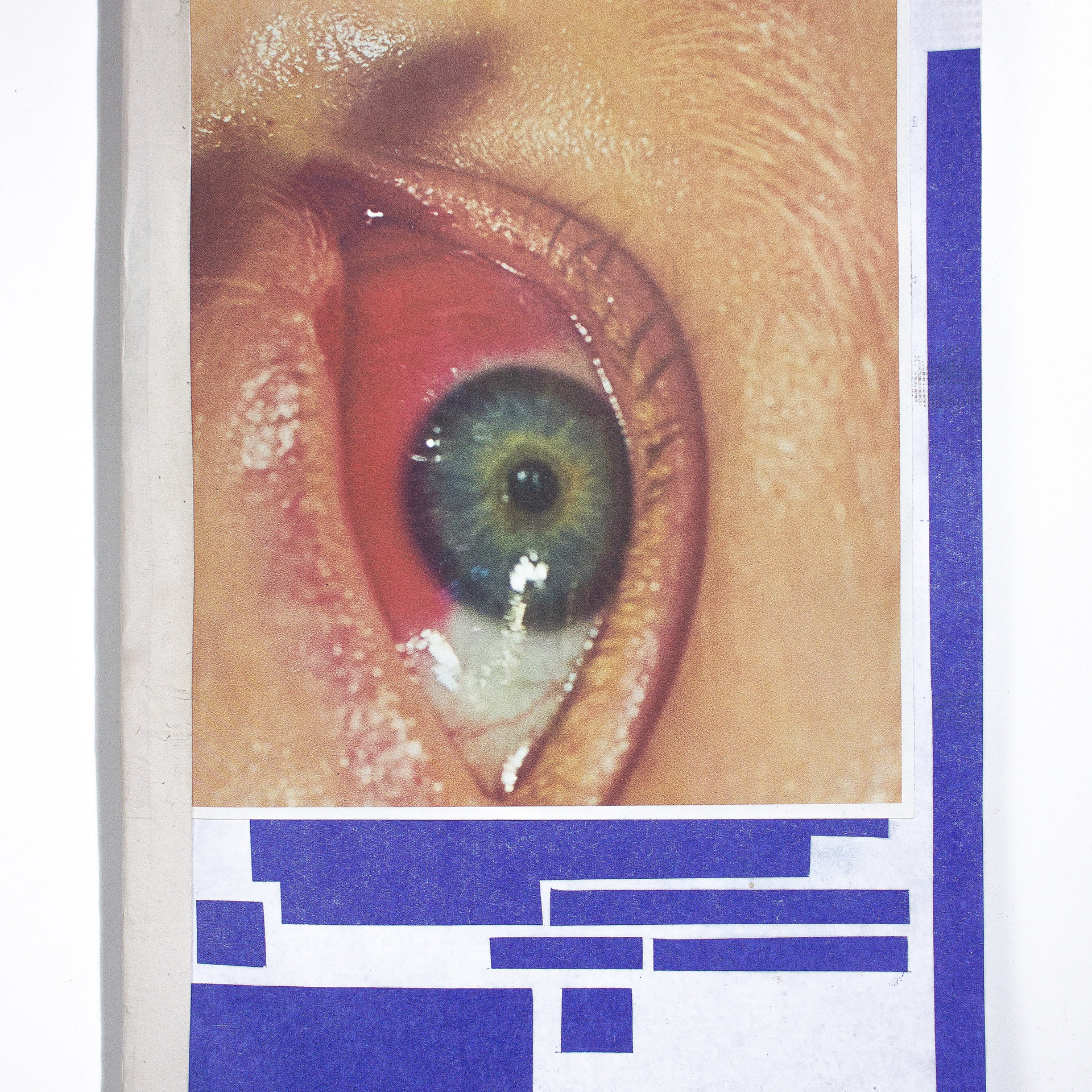
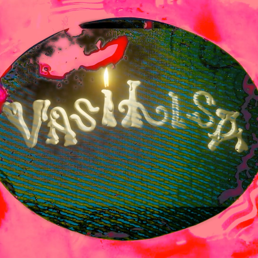
My most recent typography project was a variable typeface that I made to go along with my dissertation publication. The characters were inspired by Greek and Cyrillic alphabets, occultist symbols, and my subconscious associations. The stamp collection was a way of immortalising and objectifying my 2d symbols - from a basic sketch, to vector outlines, laser-cut rubber, to then be stencilled on wood and varnished.
I hosted a workshop at the end of the degree show, to test out my stamps and see if they were useable. Students and members of the public participated and had fun experimenting with the symbol typeface; some wrote notes, some used them as imagery. I prepared scrap paper from my studio's recycling bin to create mixed outcomes and save cost on materials.
Crossbones Typeface (2020)
Location inspired variable typeface from 1st year. See books + zines for more info.

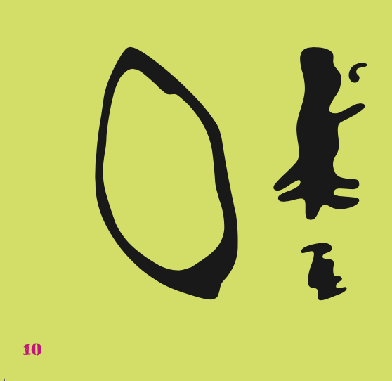
FLUID GLITCH (2019) Experimental typeface, playing with the juxtaposition of soft and angular lines.
